-
 Blog
Blog
-
 Measuring Metrics with Teamscale

Who doesn’t love code metrics? They measure your progress in achieving a goal. They can help you objectively answer important questions. They help you understand complex situations or problems.
However, there are some caveats: it’s easy to pile on a ton of metrics and be drowned in information. Selecting the relevant ones is important. Some metrics may also be hard to interpret when you see merely the raw data. Only with the right visualization will you reap its full benefits and gain an intuitive understanding of your problem.
Code Metrics as First-Class Citizens
Teamscale calculates a lot of different metrics for your source code. The following screenshot shows Teamscale’s Metrics perspective with all metrics enabled. You can see how the screen is overflowing because there are so many.
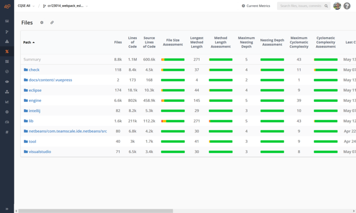
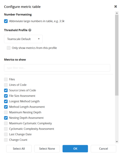
Here at CQSE we believe in personalized feedback. Therefore we make it possible for you to only show the metrics that are really relevant for you. For me, e.g., Clone Coverage and the overall number of findings are two very useful indicators, so I configured Teamscale accordingly (plus some other interesting ones):
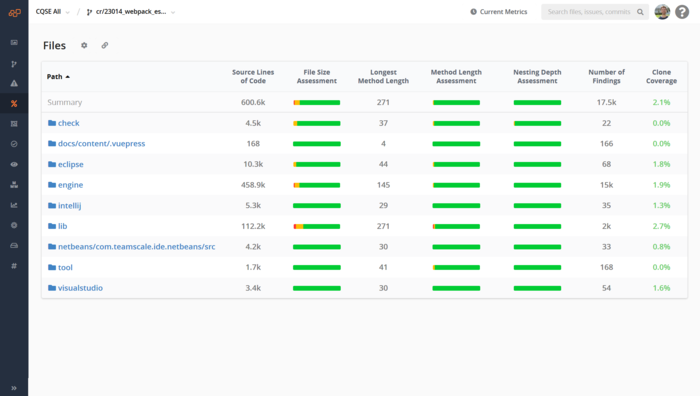
The result is is a very clean view on the code metrics. For each top-level folder of our project, I can see the relevant metrics. If I want to dig down to a deeper level, Teamscale will show me the metrics aggregated up to those subfolders and even for a single file. This allows me to find hotspots of cloning or large portions of code that contain many findings.
Visualizing the Important Things
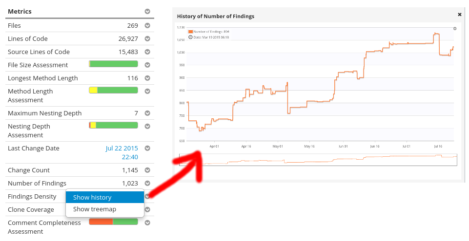
For the whole system, though, raw numbers are not that exciting. Instead, a good visualization will tell you much more, much faster. For example, from the sidebar of the code file view, you can directly request a treemap or the history of any metric, e.g. the trend of the number of findings in the current folder:
Usually though, you’ll have some metrics that you will want to check on regularly. For this purpose, Teamscale offers dashboards:
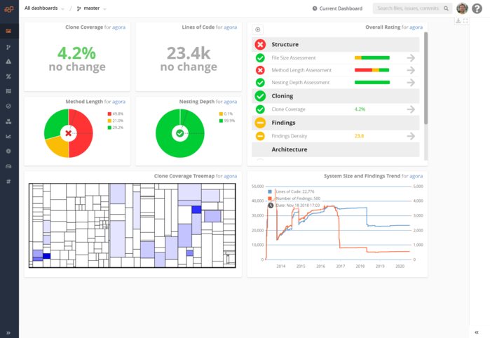
These are fully configurable and customizable. You can place the widgets anywhere. All of them can be focused on the entire system or on freely configurable parts of the repository, depending on your repository layout.
Plus, they let you visualize the time component, as you can, e.g., see in the line graph of the clone coverage. This helps you see how your project develops over time and gives you a great sense of progress when you start cleaning up your code!
Measuring what’s important to you is one thing, but setting a target for yourself that you want to achieve enables lasting improvement. These dashboards let you visualize these goals (e.g., less than 10% clone coverage or no compiler warnings) and make them visible to everyone on the team. Just share your dashboard with them! We even hung a giant monitor in our offices just to display our KPI dashboard. This motivates people to stay on track and feel responsible for the quality of their source code.
Related Posts
Our latest related blog posts.
