-
 Blog
Blog
-
Teamscale Live Demo Now Available

Teamscale is our tool for continuous software quality control. It provides feedback about quality problems in near real-time, allowing you to keep your software free of technical debt.
Today we are proud to announce our public demo, allowing you to try and explore Teamscale easily.
To get started, go to our Teamscale Demo registration page and register a user for the live demo. You will get an e-mail containing your new password and a login link. Follow the link to login and explore Teamscale.
Introduction to the Teamscale Web UI
After the login you will be taken to Teamscale’s dashboard perspective. Teamscale’s web UI is organized in different perspectives, which you can see in the navigation bar at the top of the page:

- Dashboard - Shows dashboards providing an overview of a project
- Activity - Displays the quality impact of each analyzed commit
- Findings - Lists findings and problems identified by Teamscale
- Code - Explore your code base using a file tree like approach – all the way down to the code level
- Architecture - Shows the results of the architecture conformance analysis and the violations detected
- Delta - Compare any two versions of the system with each other
This post will discuss the Dashboard perspective as a first starting point. This perspective displays dashboards with freely configurable widgets to provide an overview of the metrics and findings in a project.
The dashboard perspective in the demo features three pre-defined dashboards to give you an overview of the quality metrics and findings found in three sample projects:
- Jenkins - A continuous integration server written in Java
- Doxygen - A documentation tool for C++, written in C++
- Agora - Software/framework written in JavaScript, used by the German Softwerkskammer for their main website
Of course the configurations used for the demo are just examples and can be adjusted according to each project’s individual needs.
Dashboards
Teamscale enables developers to configure dashboards to show and visualize metrics and other quality data for one system or even a portfolio of systems. Developers can create as many individual dashboards as they need to get the information most relevant for their personal work context. They can share them with colleagues or the whole developer team.
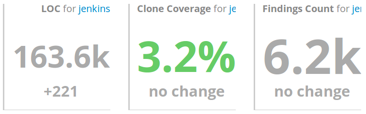
Each dashboard is comprised of several widgets that can be arranged using drag&drop and be configured using several parameters. I will explain those used in the sample dashboards. The first three widgets each display a single metric value and the change over the last seven days. First is the Lines of Code (LOC) counter, followed by Clone Coverage (the percentage of code that exists multiple times, e.g., from copy-paste programming). Last is the number of findings, which is the total number of potential problems Teamscale found in the analyzed code-base.
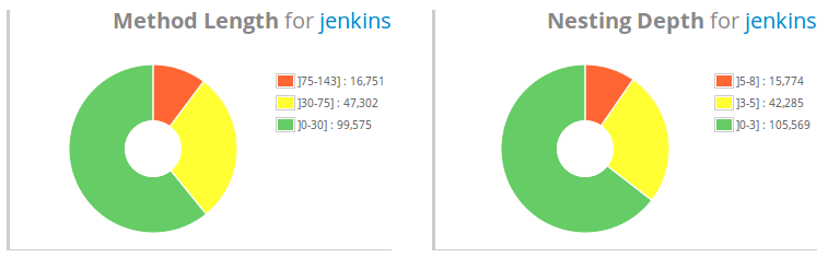
The two pie charts below display the percentage of code that adheres to the predefined thresholds for method length and nesting depth (Read why we use these simple metrics and not cyclomatic complexity). Each diagram has three areas: green (good), yellow (not optimal) and red (most certainly a problem). We usually use values of 75% ‘green’, 25% ‘yellow plus red’ and 5% ‘red only’ as quality targets.
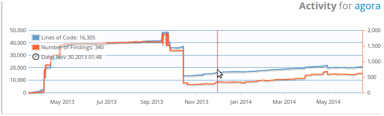
The diagram on the bottom of the dashboard’s left hand side (also shown below) depicts the project’s development history concerning the size in lines of code and the number of findings.
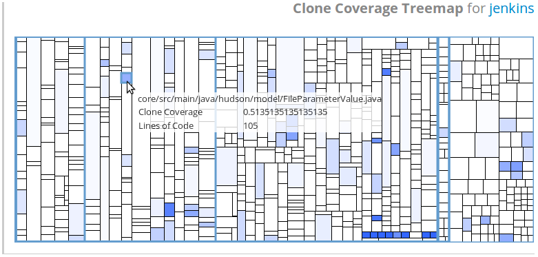
At the bottom right a treemap provides an overview of the clone coverage in different regions of the given code-base. Each rectangle represents one file in the repository, the size representing the file’s length measured in lines of code. The more blue a rectangle is, the higher its clone coverage. To explore files with a high clone coverage, simply click on the given rectangle. This will take you to the annotated code listing in the Code perspective, which we will explain in a follow-up post.
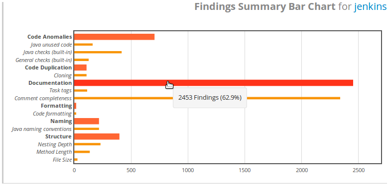
Last but not least, we have the finding type bar chart widget in the upper right corner. It provides an overview of the different finding types and their quantity in the analyzed project. To further inspect the results, you can click on any of the bars and Teamscale will show the corresponding list of findings in the Findings perspective, which will also be discussed in detail in a future post.
Of course, every dashboard can be customized and shared with other users, allowing you different views on the project, depending on what you are working on.
What to do next?
As next steps, here are some ideas of what you can do:
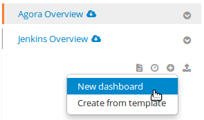
- Create your own dashboard using the add dashboard button on the right hand side below the other dashboard names. Custom dashboards can freely choose, align and configure the widgets used.
- Explore the project history using the Activity perspective
- Take a look at the findings using the Findings perspective
We will be posting a series of blog posts concerning different tasks using Teamscale in the coming weeks, so stay tuned for more.
Have fun using Teamscale and make sure to let us know about any problems/ideas in the comments below or by sending them to support@teamscale.com!
Working on an open source project and want to use Teamscale for your development? Contact us at support@teamscale.com!